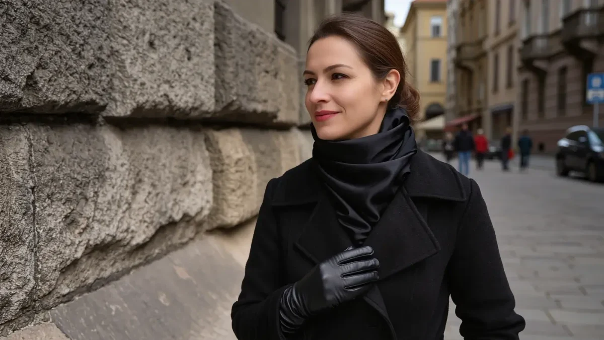
Some situations forbid loud color: the office with a muted dress code, the monochrome wardrobe, the single carry-on where everything must match everything. In those constraints, one tool still produces richness where color cannot: texture. A matte knit against a glossy leather, rough tweed over fine poplin, heavy wool falling against a silk slip — contrast in surface does for a quiet outfit what contrast in hue does for a loud one. This column argues texture is the most underused instrument in adult dressing, precisely because it never announces itself.
We frame the argument as composition, not shopping: the claims concern how surfaces interact with light, which is optics before it is fashion.
Why does texture substitute for color?
Because both tools work by contrast, and the eye does not care which kind. Color contrast separates garments by wavelength; texture separates them by how they reflect light. A rough surface scatters light and reads matte and warm; a smooth one reflects it and reads sleek and cool. Put the two side by side and the boundary between them is as legible as red against green. Photographers know this well — texture is what survives black-and-white conversion — which is why a tonal outfit of mixed surfaces photographs with depth while a tonal outfit of identical surfaces photographs flat.
Texture also carries information color cannot: it signals weight, warmth, and care. A tone-on-tone look of cashmere, leather, and wool reads luxurious at close range in a way no dye achieves, because richness is being demonstrated rather than declared.
Which textures contrast best?
Think in pairs across a rough–smooth axis. Wool tweed against silk. Chunky cable knit against a fine poplin shirt. Raw denim against soft suede. Quilted nylon against heavy melton. Linen against polished cotton. The rule of thumb from ateliers: each major piece should sit at a different point on the axis. Two roughs adjacent dissolve into one mass; two glosses adjacent read as a uniform. The classic winter proof is the black total look done well — matte coat, satin lapel or slip, leather boots, ribbed knit — five blacks, five surfaces, unmistakably composed.
Weight is texture's quieter sibling and pairs with it: heavy against light in the same color family — a dense coat over a floating skirt — creates movement, since the two fabrics fall and travel differently as the body moves. Still photographs miss this; video and life do not.
How do you build a texture-first outfit?
Start with the constraint rather than the palette. If color must stay quiet, pick three fabrics before three colors: one matte base, one smooth second, one contrasting third, then let the palette follow neutrally. In packing, the same arithmetic rescues the carry-on: three fabrics in three neutral colors yield more distinct-looking combinations than six colors in one cotton, because every combination inherits surface contrast automatically. And in shops, run the hand test before the mirror test — feel the fabric with fingertips closed; if a candidate piece feels identical to something already owned, it will look identical too, whatever the swatch card says.
Care follows texture as well, and honestly so: mixed-surface outfits concentrate their maintenance in the delicate piece — the silk that needs hand washing, the suede that fears rain — so a texture-first wardrobe rewards knowing each fabric's rules before the first wear.
What does the eye actually do with mixed surfaces?
It ranks them without instruction. Viewed from across a room, a matte surface reads as solid and near, a glossy one as fluid and shifting, and the difference assigns each garment a role: the matte piece becomes the outfit’s ground, the glossy one its accent, the rough knit its texture lead. That silent casting call is why two people can wear identical palettes and produce entirely different impressions — the surfaces, not the shades, are doing the casting. It is also why cheap gloss reads louder than expensive gloss: inexpensive satin reflects hard, uniform light, while quality silk and well-finished leather reflect with depth. Texture is one of the few categories where spending shows itself most clearly at close range.
The thesis at the close: color shouts and texture persuades. Where volume is unwelcome, surface contrast is how an outfit stays interesting at whisper level — no new palette required, only a fingertip's judgment exercised at the closet door.
Sources for this piece include BBC Culture's coverage of fashion and craft.
For more context, read What a three-color limit actually does to an outfit.
For more context, read contrast in outfits.
For more context, read The case for dressing the same every day.